The Tom Bowl
![]()
![]()
![]()
![]()
![]()
![]()
![]()
![]()
![]()
![]()
![]()
![]()
![]()
![]()
![]()
![]()
|
Tom Bowl Museum |
|

|
|
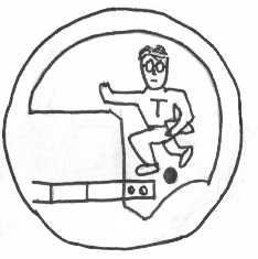
1989
A recreation of the first logo. It's about as good as you can expect a logo to be when it is drawn at 1 in the morning and you should be studying for exams. We believe the pose of the player was inspired by the Heisman Trophy.
|
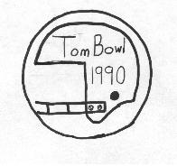 |
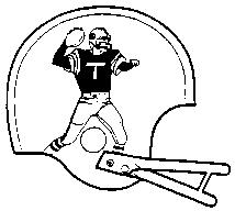
1990
The helmet design was kept, but the caricature of a running football player without a helmet was replaced by the simple, but eloquent, Tom Bowl 1990. The reason for the replacement was that we sent away all the letterhead we made with the first logo on it and didn't realize it until the last minute.
|
|
|
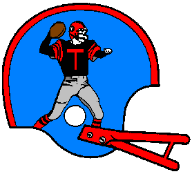
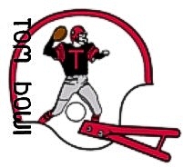
1990-1997
The longest continually used logo is still found on Tom Bowl letterhead. There have been minor changes, such as cleaning up the T on the shirt and attempts at putting a little T on the side of the player's helmet. Note, for no particular reason the helmet now faces the other direction.
|
|
|
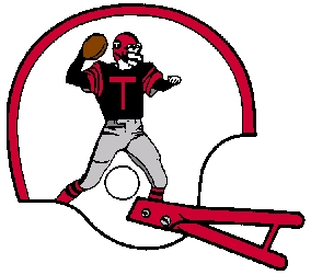
1998
The truth is, the Tom Bowl got so darn excited about having an opportunity to do some things in color they went nuts and chose this gaudy arrangement. This first showed up on the original Tom Bowl web site. This logo, and the color of the original site, were the subject of much ego-damaging scorn.
|
|
|
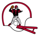
1999 (Present Logo)
We like this new color arrangement much better. White helmets are cool.
|
|
|
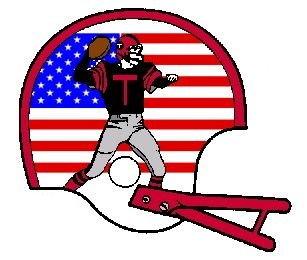
2001 This helmet with flag design in the background was created in tribute to the American spirit shown in this country in the aftermath of events on September 11, 2001. |
|
|
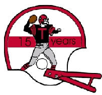
2003 This helmet was designed to commemorate the 15th anniversary of the Tom Bowl. We liked the stripe but were not so sure about the 15 years thing. |
|
|
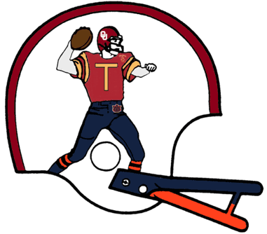
2004
(not an official logo) Designed by Tom Bowl fan identified at lilhorn3. This logo was designed to honor Tom Bowl XVI by combining the participants in the three-way game. In this logo the helmet is Oklahoma's, the jersey is USC's and the pants are Auburn's. This logo appears on the Tom Bowl XVI page. |
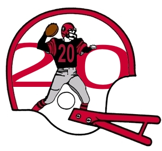 |
2008 The first new design in four years, this logo was designed to celebrate the 20th anniversary of the Tom Bowl. Perhaps the double 20s represent a vision of the future but that wasn't the intent at the time. |
 |
2011
(proposed) This logo was designed by the daughter of the Tom Bowl president. She described it as "pretty stupid." We disagree. |
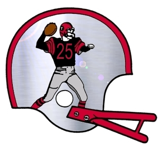 |
2013 To celebrate 25 years of Tom Bowl this snazzy silver helmet with lens flair was created. It was a bit of a trick to make the helmet look metallic and not just an inconsistent shade of gray. |