The Tom Bowl
![]()
![]()
![]()
![]()
![]()
![]()
![]()
![]()
![]()
![]()
![]()
![]()
![]()
![]()
![]()
![]()
|
Tom Bowl Museum |
|
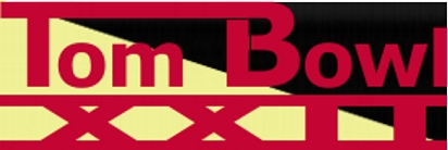
Since the creation of the web page for Tom Bowl X we have created special banners for each game. Below is a display of all the banners used since Tom Bowl X.
|
Tom Bowl X |
Now this banner is all about excitement. What set this apart was the use of a special technique which involves using a slightly larger font. |
|
|
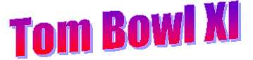
Although we never realized this beforehand, the banner for Tom Bowl XI looks a lot like the banner for the logo gallery which is interesting to us for some reason. We also think its ugly. |
|
|
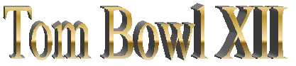
Simple straightforward metallic letters. The Tom Bowl XII banner is a classic. Note the use of 3D shadowing and how for some reason it gets thicker the further the letters go. We aren't sure why that is and we don't like it.. |
|
|
There isn't anything really interesting about this one. It's very symmetrical and rather brownish. But we like it well enough. |
|
|
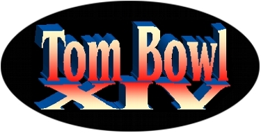
The banner for Tom Bowl XIV is bigger than most. It's also the first to have a big black blob around it. It gives it a neat depthy kind of look on the PC. At least we think it does. |
|
|
We wanted something nifty and kind of throw backish to commemorate the 15th Tom Bowl. We aren't sure if we succeeded. |
|
|
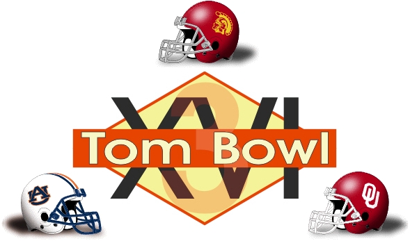
This is our favorite logo we ever came up with and we felt exceedingly proud when we got to see it on national TV when it was used by CNN Headline News as part of their coverage of Tom Bowl XVI. This was also the year we quit using Word Art for our logo and started using Corel Draw which we think is pretty evident. We were also excited about how we were able to work the subtle "3" into the logo because of the three way game but were not sure it was all that subtle. The first version of the logo didn't have the three or the helmets. |
|
|
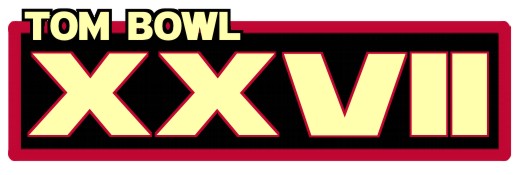
This logo was the result of the first annual Tom Bowl Logo Contest where fans were invited to make a game logo for Tom Bowl VII. This logo appeared in the Sporting News so it was shown (although very small) in a national publication. We like this logo for its simplicity and its use of a football. Really, the football graphic makes this the first logo we ever used that contained a tangible recognizable element (whatever that means, sounds impressive). |
|
|
Big blocky powerful. That sums this one up. Yes sir. Gotta love Impact as a font choice. The beam across the middle. It's all about bolditivity a word made up just for this logo design. |
|
|
We must have liked this one because when we started to make the Tom Bowl XX logo I realized we were basically making that one look just like this one without even realizing it. Must be all the XXs. So, anyway, we had to come up with something completely different for that logo. We did like this one, its big and blocky like the one before. Apparently we really like big and blocky. Still lovin' that Impact as a font choice. This was our most reddest banner. |
|
|
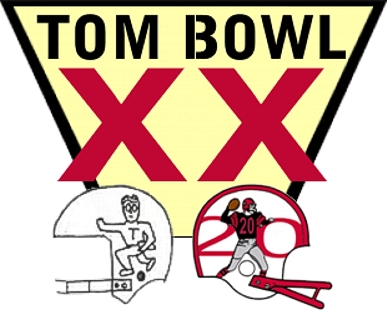
This special 20th anniversary of the Tom Bowl was the first logo to incorporate the helmet into the actual game day banner. We do like the way the two helmets, and the icons on them, aren't looking at each other. I'm not sure why. Do you see the subtle 3 in there? Isn't that terribly clever? There was no real inspiration from this. It was the first attempt to break away from the blockyness of the last two logos. |
|
|
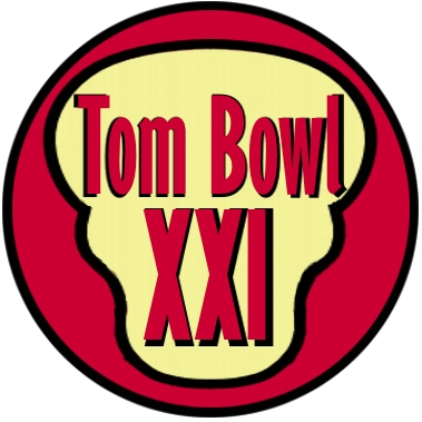
This monstrosity was designed with a skull-like quality to impart a feeling of sudden death in this six game colossus that was Tom Bowl XXI. We really don't think it worked at all. However, it is very unique. I don't think it looks even remotely like any of the past logos. |
 |
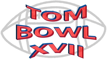
I don't know what to think about this one. It's almost like a good vs. evil thing with this messy linear text blob in front of it. By far our widest logo if anyone is keeping track of that sort of thing. |
|
|
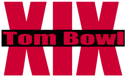
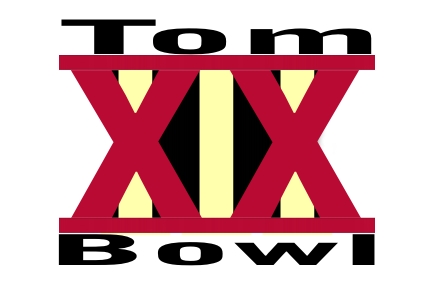
This one was primarily about symmetry and in that effort it was a success. Do you see the III back there? I'm sure you do. It's not that subtle. But maybe. Interestingly if you look at it long enough, you can kind of see the logo for Tom Bowl XIX hidden in there. Not intentional, I assure you. |
|
|
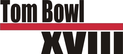
This was all about the black background and the yellow edging on the letters. I figured out how to make the yellow edging, it wasn't all that hard, but I hadn't been able to figure it out before. Hence the logo for Tom Bowl XXIV. Lots of letters in this one. |
|
|
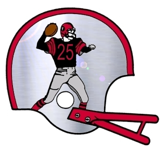
No special banner for this season. Nothing could out do the snazzy metallic Tom Bowl 25 helmet complete with lens flair. We kind of like this one, but we aren't going to replace the current logo with this one because white helmets are cool. |
 |
This one. Well, it's about as boring as it gets except for the funky T. This one is right up there with XXII logo for wideness. |
|
|
De-emphasized the Tom Bowl part of this in favor of the Roman Numerals. So this is like an in your face XXVII. I also think there is more than a little Star Wars in here. |
|
|
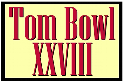
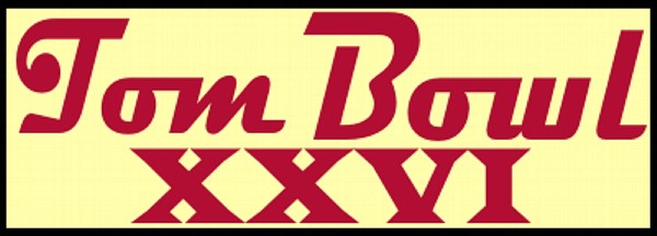
Oh look. We inadvertently recreated the logo for Tom Bowl XXVI. It's like, look, the the new improved Tom Bowl XXVI logo but now with TWO more II and letter shadow!!! Different look, same great product. |
|
|
These banners are in a thematic rut. Look at this. How much variety is there in just extending the crossing T across to the B? Looks like we just alternate between black background and the yellowy color. Need to shake this up. |
`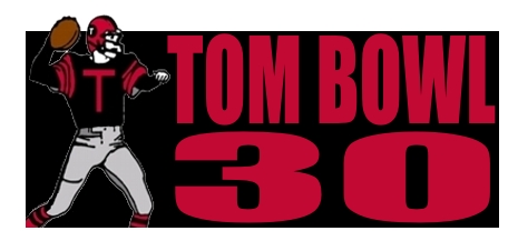 |
Now we are getting fancy. Total shake up, but merited for the big 30th anniversary game. Okay, it's not that big of a shake up. Worked on the traditional logo with a numeric 30 because, well, all those Xs may not be a good idea |
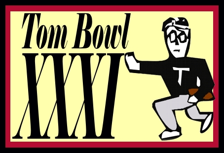 |
Keeping in the theme of using the logo guy, this is the stylized version of the original logo. Note the use of italics... the words are pushing back. Yes, they are. Does this mean anything... that's for you to decide. |
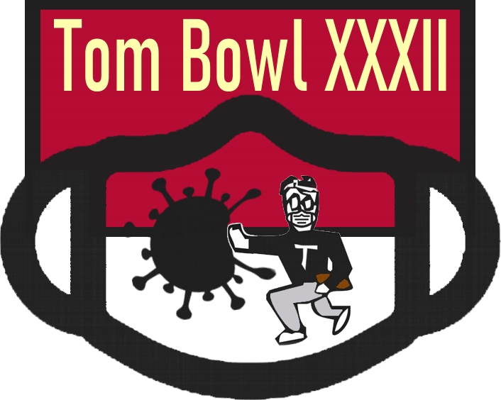 |
This one was inspired by COVID and dedicated to all those willing to mask up for their safety and the safety of others. Non-political thing here, just look at it as being creative. |
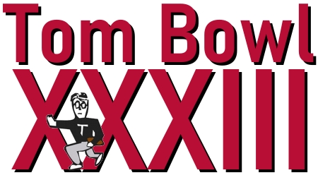 |
Note that the logo guy is now on the left side whereas last time he was in the middle and before that on the right. He's making progress. Yup. Came up with that on the fly. Note the lack of any yellow in this logo. |
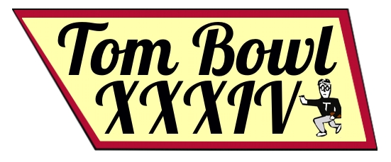 |
Oh, no. The logo guy is back to the right. Lost all his progress. This ended up somewhat of a strange homage to Tennessee. Brought back yellow. Also, for now, the last one made by hand. |
|
|
First AI logo and wow, there is a lot going on here. Actually kind of a visual mess. And with the football in the middle, it almost looks like it says, Toom Bowl. And there are strange religious connotations in this logo. Unappealing AI drivel. Glad it says "Football" on it in case anyone has the wrong idea. |
|
|
Yes, another AI generated logo. Very nice. Shows AI progress. The stars are fun, right? I mean, I think so but everyone is entitled to their own opinion. There is no symbolism here. Just... stars. No idea why they were added. |